As I researched the community of 'mappers' visiting this event by looking at other conferences, community boards, and social media, I realized that the community is truly global. Therefore, the iconography I used to represent the city, not only needed to be recognized in different cultures but also resonate with an audience that is smart, tech-savvy, and collaborative.

I chose to develop a concept merging the iconic Belgian waffle (as a Belgian tradition that is part of modern culture), and an abstraction of the City's center map.

After winning the contest, the Organization wanted to work further on the logo. They were concerned that the color palette used could turn boring when implemented on the entire branding of the conference, and that without seeing the title of the logo it might be hard to recognize the waffle shape, especially for people who don’t know anything about Belgium.

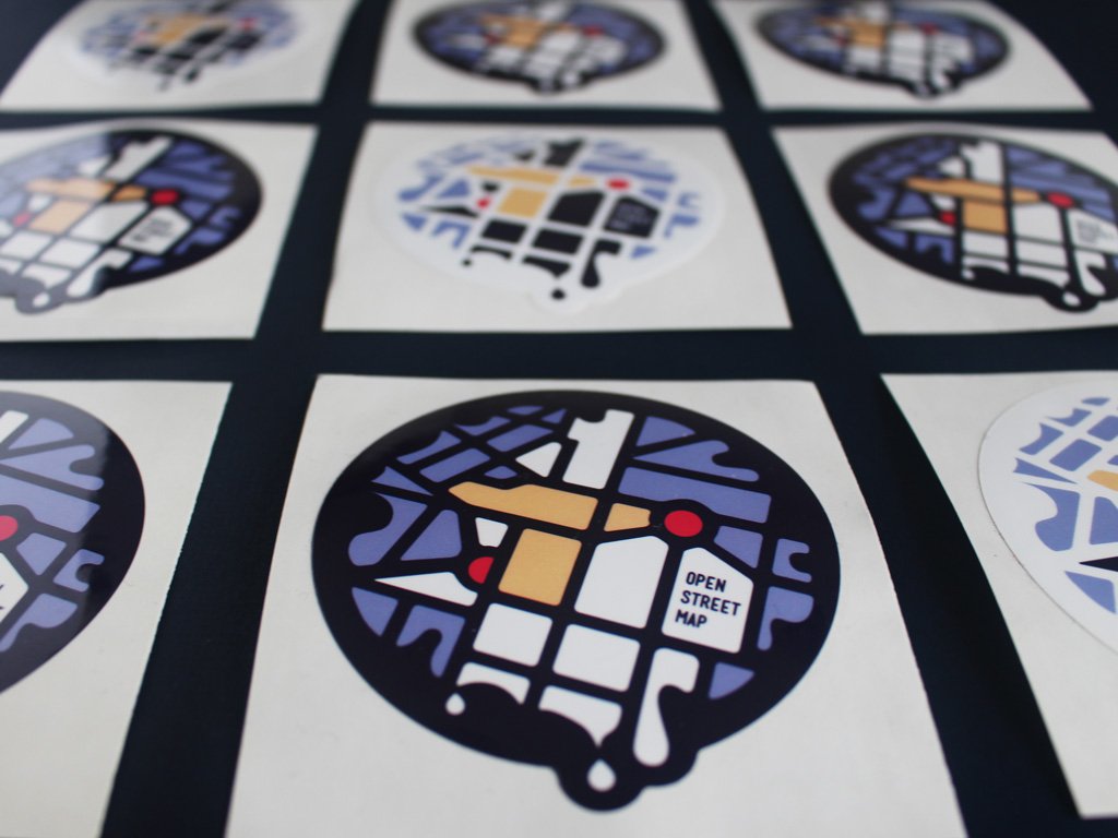
The challenge was to come up with a color palette that still helps identify the waffle and be fun. I worked on saturated color palette explorations, that remained warm so it was still possible to read this as a waffle. Then also added different form versions to clarify that it was Brussels waffle.

We continued exploring different color schemes, that didn’t look like literal waffles anymore, but look more ‘fresh and techie’ overall. The organizers decided to shift the focus: since this was a mapping conference, the map tech and fun vibe were more important than actually being able to recognize the waffle at first sight. The waffle was a nice surprise to find as a second read.

The change in colors also helped the brand to look more ‘digital and modern’, which was quite important since a big part of the conference was about data.