Background
Through research, we have found that FORMEL Skin users want to test the treatment for minimal cost and time before they commit to the subscription service. The issue is, that at the one-month time stamp, there is a ‘break in’ skin treatment phase in which most users will experience irritation, exactly at the time when they would need to buy the second month of treatment to experience improvement.
We have been testing several solutions to this problem: i.e. more information on the break-in phase on onboarding, discounts on the first two months, and influencer marketing among others. This project is trying to address the problem via different price schemes that can facilitate the conversion and retention of the user.
The FORMEL Skin User Journey
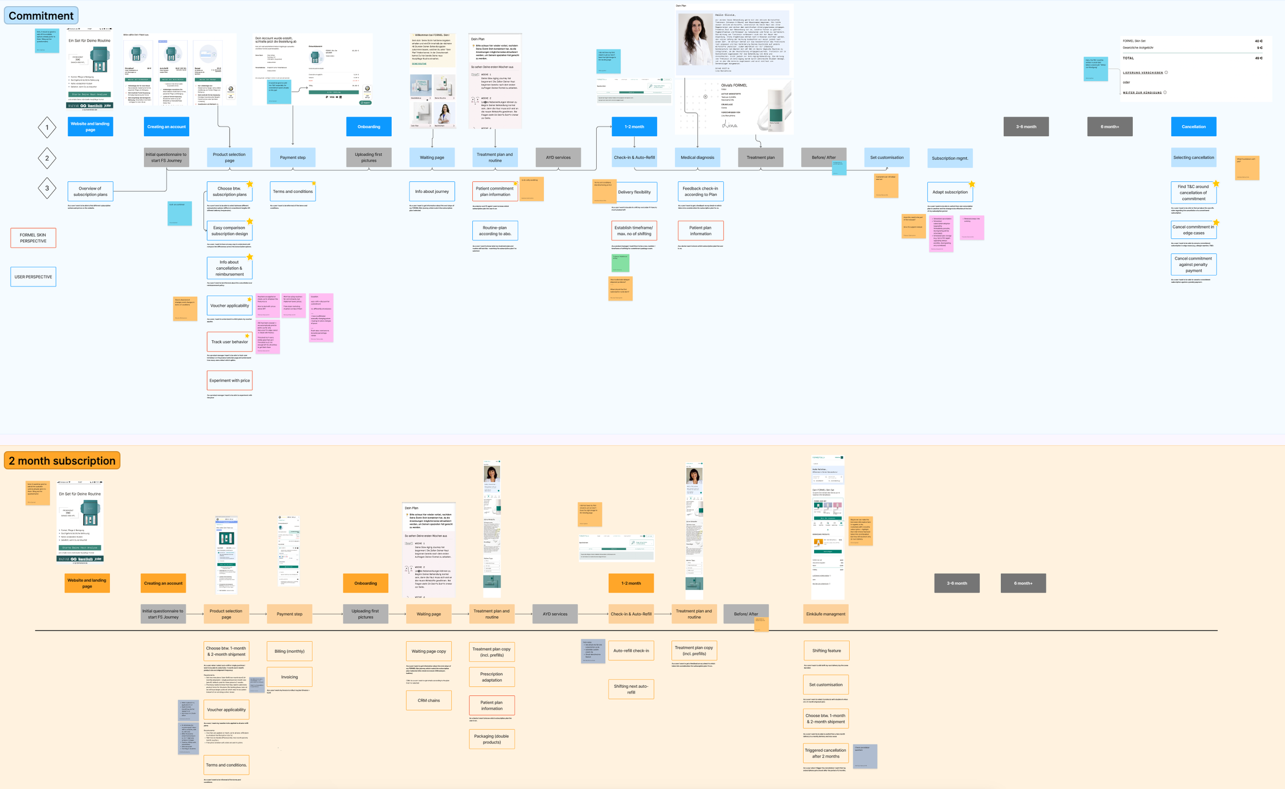
In May 2022, Silvia Ivanova (the other designer on the product team) and I worked on an end-to-end user journey, so that we could understand the whole journey from both of our ends. (She had been working on retention and I on funnel and onboarding).
We then brainstormed ideas and shared them across the company with all different and relevant departments, hoping to spark new initiatives that could improve the lives of our customers and thus convention and retention.
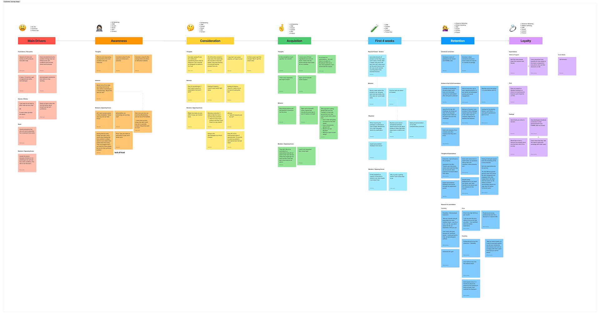
“I don’t want to pay for a subscription that won’t work (for me)”
Pain Points
Fear of commitment
Price. Can make an extra effort to pay, but it better work.
Opportunities
An initial low-cost version that hooks users for the 6-8 weeks it takes to start seeing results
Research
The Growth team took the idea and interviewed customers, then researched into logistical, legal, and monetary feasibility and impact of different subscription plans: 2 month plan and a commitment plan.
Competitive Analysis
After reading and understanding the background and many meetings, we started the design process. I researched competitors and other services that could help us ideate on what standards of presenting this content are. And also what not to do.

(Side note) Previous Optimization of the Plan Selection step of the funnel
As part of my work with the Conversion Rate Optimization (CRO) team, I have participated in the ideation, hypothesis creation, and design of experiments for the plan selection step that is involved in this project. Some of the changes that have been successful experiments are:
1. Moving coupon input to the cart
2. Highlight Money Back Guarantee
3. Bigger Box image
4. Overall redesign to remove clutter
5. Copy that speaks to the language patients use
Initial Prototypes & User Testing
Alerts
After several initial sketches, I roughed wireframes that naïve users recruited via www.userinterviews.com could read and test on real phones to get more real-life feedback.
Test 1
On the first test, we wanted to break the decision-making into bite-sized moments to not overwhelm the user with a lot of information plus have to make a decision. Therefore, I divided the screens by what> how> how much.
Another important goal was to give information that would convince the user that a longer commitment leads to better results.
Test goals
Is the 3-step approach helping communication or making it more difficult?
Do users understand what each option of the plan covers?
What is difficult to understand?
What do they expect to get and when?
What plan would be more interesting to them? Why?
Is the UX flow clear to them? Are there pain points?


Findings
Users were interested in seeing more information on the ingredients of the cosmetics and formula AND what happens if the treatment doesn’t work
The commitment package was very difficult for users to understand and therefore they would default to just ‘doing one month and see how it goes’
Users liked before and after
Users understood the concept of the two months much faster but still were confused about the 3-month money back guarantee
After sharing with the CRO team, feedback was that to increase impact, we should address all user decisions in one screen so that the drop rate doesn’t add up in several screens
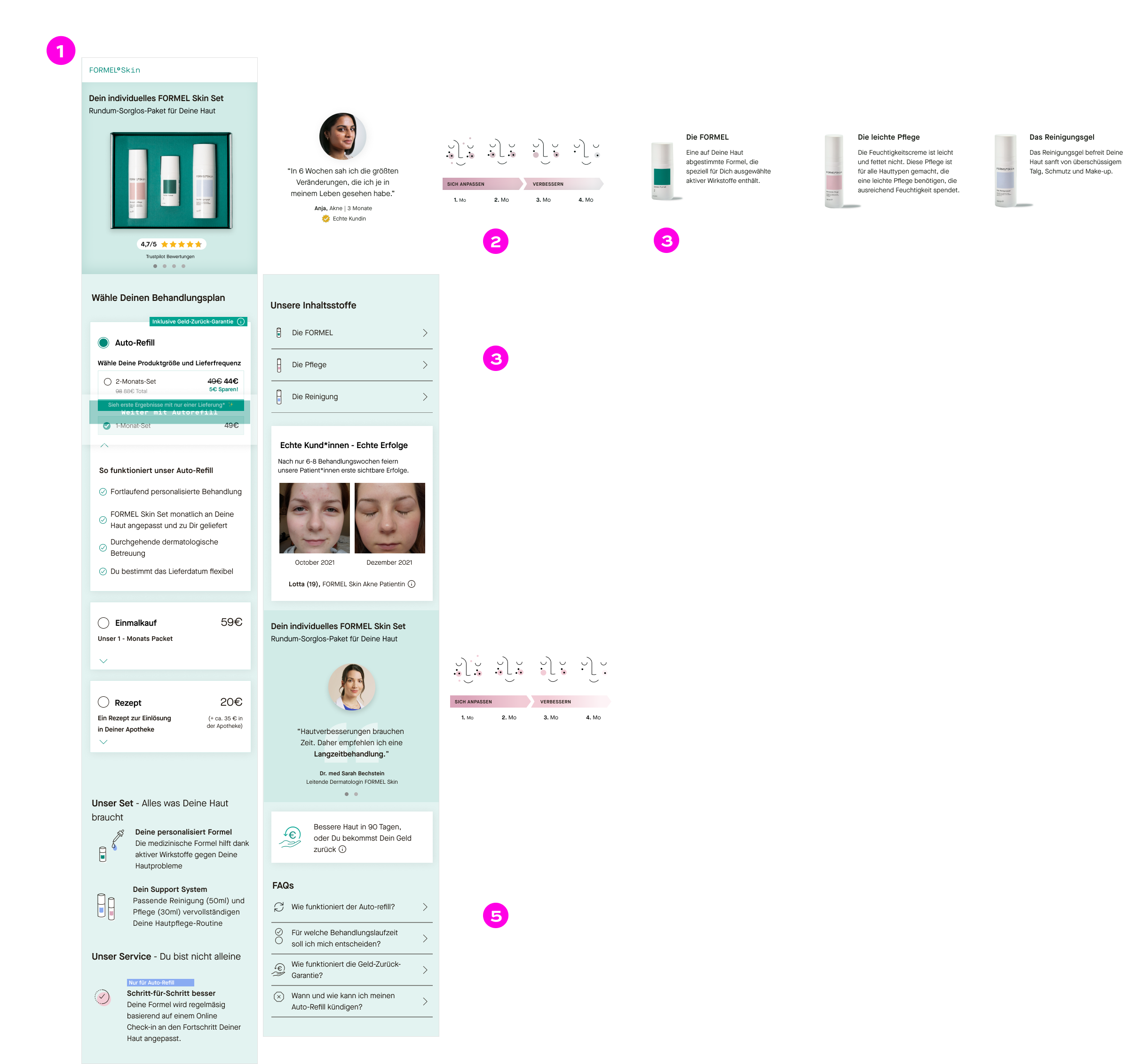
Test 2
We addressed the feedback from the initial test and the rest of the product team including CRO
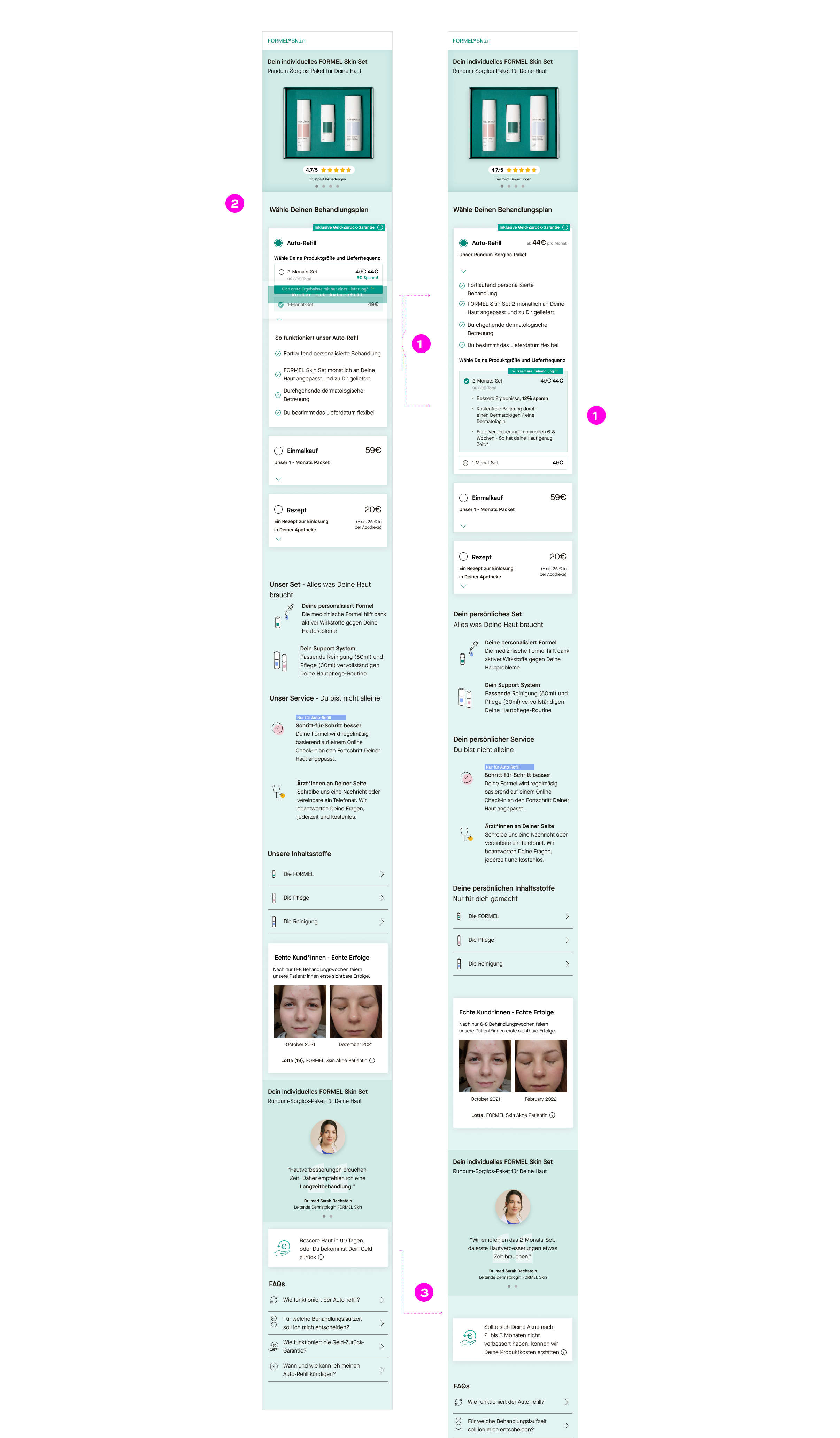
Combining all steps into one to decrease drop off rate
Creating a stronger connection of why is the doctor recommending a 2-month treatment.
The commitment package seemed too complicated for users to understand and commit to, also it brings a stronger aversion to a subscription. We decided to move forward with the 2-month package
Offering more information on ingredients
More information on what happens if it doesn't work
Findings
A bit of confusion about the difference between 2 months and 1 month. We swapped the hierarchy and added additional clarification to the 2-month selector
Users would still be more interested in this package after they have tested the product for one month. This might be more interesting to offer to current customers
The two-month package offered more clarity but there is still confusion on why is the Money back guarantee 3 months. Update Money back guarantees to show that it is 60-90 days.
Next Steps
• The 2-Month plan will be A/B tested vs current offerings. If successful, we will need to add a section to the account area where users can change their plans. For the test, we would be asking users to contact Customer Care.
• There is a lot of potential to continue iterating on USPs, the hierarchy of information, and even pricing on this next layout, as it provides much more information than before.
A note on UI/Style Guides
When I first started at FORMEL Skin, there was no real style guide or library to refer to. Previous designers were copying and pasting from existing files. One of the first tasks I established for myself was to work with developers to create a dev library that we could align with the Figma library. This took some time as we updated element by element, but by July 2022, with the help of the Design intern Nina Kraus, we were able to finalize a library that can be updated anytime a brand is updated.


